Fonts aren’t just letters on a screen—they’re the personality behind your words. And what better way to spice up your typography obsession than with font puns? In 2026, font puns are making headlines in memes, social posts, and even office Slack channels.
Whether you’re a designer, writer, or just someone who enjoys a clever typography joke, these puns will tickle your funny bone while making your colleagues wonder if you’ve been staring at Helvetica too long.
From serif shenanigans to sans-serious humor, this collection blends witty wordplay with typeface tropes. So grab your Comic Sans (don’t worry, we won’t judge) and get ready to laugh, groan, and maybe even rethink the font you use in your next presentation. Font puns are here to turn your letters into laughter, one bold punchline at a time.
Classic Serif Puns
- I asked my serif font out on a date; it said it was already committed to Times New Romance
- Serif fonts don’t gossip—they’re too well-kerned
- I tried to impress a serif; now I’m stuck in Italic trouble
- Serif fonts love long walks on the baseline
- They say serif fonts are fancy, but I think they just want a little extra flourish
- I told my serif font a joke; it said, “I’m not that kind of type”
- Serif fonts always stick together—they’re really bonded by style
- My serif font can’t keep secrets—it’s always spilling the ink
- You can’t scare a serif font; it’s already bold and brave
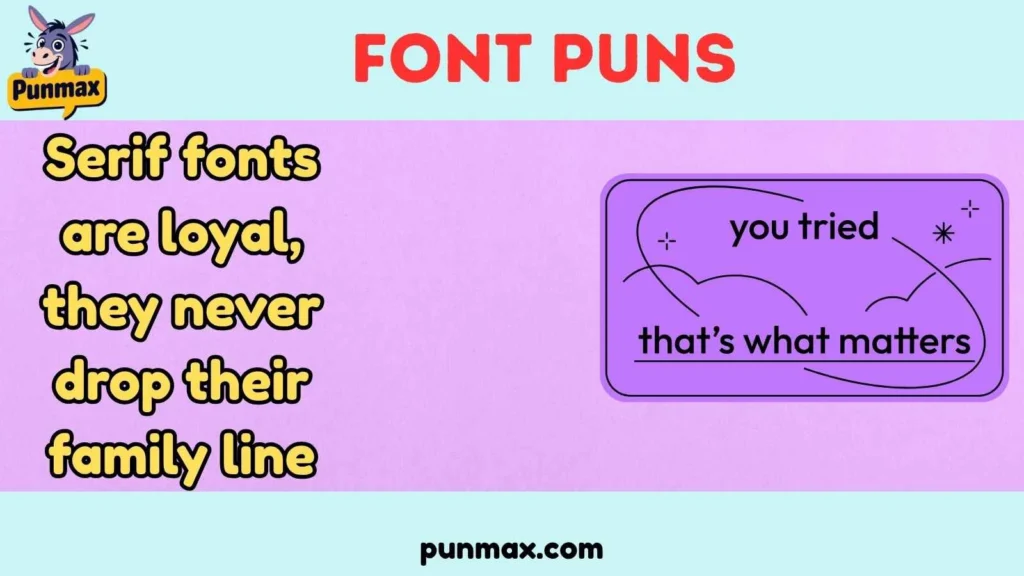
- Serif fonts are loyal, they never drop their family line
- When a serif goes to the beach, it loves to catch some lines
- I complimented a serif font, and it blushed in light italics
- Serif fonts hate clutter; they like their edges sharp and clean
- Don’t challenge a serif—it will outtype you
- I tried to argue with a serif font, but it had the last word in Times New Roman
Hilarious Sans-Serif Puns
- Sans-serifs are minimalist; they don’t have time for drama
- I asked my sans-serif to calm down, it said, “I’m already relaxed”
- My sans-serif font is so cool, it doesn’t even need a serif to shine
- Sans-serifs go to parties; they’re always line-less and carefree
- When a sans-serif sneezes, it says “Achoo-tomatic font”
- Sans-serif fonts never fight—they keep it smooth
- I tried to italicize my sans-serif, but it said “Not today, friend”
- Sans-serifs love modern art; they admire clean lines and empty spaces
- They’re so casual, sans-serifs drink their coffee without a cup handle
- I caught my sans-serif dancing; it was grooving on the baseline
- Sans-serifs are secretive; they avoid extra strokes
- My sans-serif font plays the guitar; it really knows the right chords
- Sans-serifs are smooth operators; they never kerning under pressure
- I asked a sans-serif for advice; it said “Keep it simple”
- Sans-serif fonts don’t judge—they’re open to all characters
Script and Handwriting Font Puns
- My script font is dramatic; it always leaves a trail
- Handwriting fonts are shy—they always stay in cursive
- I asked my script font a secret; it whispered “Don’t break my flow”
- Script fonts love love letters; they write straight from the heart
- My handwriting font can’t commit; it’s always changing strokes
- Script fonts hate messy desks; they prefer flowing lines
- They say script fonts are elegant, but I call it fancy squiggles
- Handwriting fonts gossip; they always leave a little note
- I tried to trace my script font, but it was too elusive
- Script fonts never panic; they always curve gracefully
- My handwriting font went on a diet; now it’s slimmer and italicized
- Script fonts are romantic; they always make a swoosh
- Handwriting fonts love tea; it’s perfect for curling letters
- Script fonts hate clutter; they prefer flowing lines
- My script font told me a joke, and it was pun-derful
Bold and Italic Font Puns
- Bold fonts never whisper; they always make a statement
- I tried to argue with an italic font, but it leaned into my point
- Bold fonts go to gyms; they like to bulk up
- Italic fonts are dramatic; they always lean toward excitement
- Bold fonts hate quiet meetings; they want to stand out
- Italic fonts love romance novels; they bend the plot
- Bold fonts are confident—they always show up heavy
- Italic fonts try yoga; they stretch with style
- Bold fonts love attention; they never fade into the background
- Italic fonts are sneaky; they tilt your expectations
- Bold fonts drink espresso; they wake up your text
- Italic fonts enjoy dance; they lean into the rhythm
- Bold fonts are fearless; they make a strong impression
- Italic fonts love mystery; they hint at suspense
- Bold and italic together create the ultimate font drama
Punny Typography Combinations
- When Arial met Times, it was love at first kerning
- Helvetica jokes are dry—they always get a clean line
- Comic Sans threw a party; it was totally sans-serious
- Papyrus tried to impress; it just looked ancient
- Futura went to the future; it was ahead of its type
- Courier loves retro; it’s always typing on the past
- Wingdings told secrets; you couldn’t decode it
- Impact tried to shout; it was too obvious
- Verdana loves clarity; it’s the font of reason
- Georgia got comfy; it’s a classic in its own space
- Times New Roman tried humor; it was classically awkward
- Arial went jogging; it kept a smooth pace
- Comic Sans tried elegance; it failed hilariously
- Papyrus loves drama; it makes every word epic
- Futura dreams big; it aims for the stars
Web Font and Digital Puns
- Google Fonts are social; they love to be shared
- CSS tried to control fonts; it got overstyled
- Web fonts go on vacations; they surf the net
- @font-face is mysterious; it hides in plain code
- Fonts on mobile like to stay responsive
- Javascript tried a font; it ran into errors
- Web fonts love updates; they never stay static
- HTML hugs fonts; it wraps them perfectly
- Fonts on slow pages like to take their time
- Icon fonts are cool; they speak without letters
- Fonts in dark mode look extra classy
- Web designers talk fonts; they never use Comic Sans
- Fonts in apps love to fit in
- Google Fonts party? Everyone logs in
- Fonts online get famous; they always get typed up
Funny Font Mashups
- Arial + Comic Sans = a joke in plain text
- Times + Papyrus = an ancient drama
- Helvetica + Impact = a bold statement of style
- Courier + Futura = retro futuristic vibes
- Georgia + Verdana = classic meets modern
- Wingdings + Symbol = secret messaging 101
- Comic Sans + Papyrus = never do this
- Times New Roman + Arial = family reunion
- Bold + Italic = strong and lean
- Script + Handwriting = personal love letters
- Sans + Serif = opposites attract
- Futura + Helvetica = minimalist dream team
- Verdana + Georgia = readable romance
- Impact + Courier = loud and proud
- Symbol + Wingdings = cryptic chaos
Typography Humor for Designers
- Designers love fonts; they never have enough
- Kerning fights are serious; they can ruin friendships
- Lorem Ipsum is a designer’s best excuse
- Mockups are lie detectors; they reveal font flaws
- Designers are secretive; they always hide layers
- Font licenses are tricky; they cost a pretty penny
- Designers drink coffee; it fuels the kerning
- Mood boards are messy; fonts keep the vision neat
- Designers love grids; fonts align perfectly
- Color palettes are emotional; fonts stay neutral
- Fonts and designers argue; it’s always bold
- Typography workshops are fun; fonts participate silently
- Designers fear Comic Sans; it haunts their dreams
- Typeface quizzes are tricky; everyone guesses wrong
- Fonts inspire creativity; they letter your imagination
How and Where to Use These Lines
- Social media posts to increase engagement
- Instagram captions for fun typography content
- Slack messages to boost team humor
- Office presentations to break the monotony
- Email newsletters with witty subject lines
- Blogs to illustrate typography topics
- Meme creation for font humor
- Posters and flyers to catch attention
- Greeting cards to send pun-filled cheer
- Graphic design projects to highlight style
- Educational materials for fun learning
- Typography workshops to lighten the mood
- Merchandise like T-shirts for fun font jokes
- Digital art to add humor
- Writing challenges for creative font puns
FAQs
What are the funniest font puns to use in social media?
Use puns like Comic Sans is totally sans-serious, or Arial + Comic Sans = a joke in plain text for viral humor.
Can font puns improve audience engagement?
Yes, font puns make posts memorable and shareable, which boosts likes, shares, and comments.
Which fonts are most popular for pun jokes?
Helvetica, Comic Sans, Times New Roman, Papyrus, and Futura are the funniest and most recognizable for pun setups.
How do I create my own font puns?
Focus on font names, styles, and typographic quirks, then twist them into wordplay or situational humor.
Where can I use font puns professionally without looking silly?
Include them in presentations, team chats, newsletters, or educational materials where light humor is welcome.
Conclusion
Font puns are the perfect mix of humor and typography nerdiness. They take the letters you see every day and turn them into clever wordplay that tickles the mind and delights the eyes.
From serif elegance to sans-serious quips, script swooshes, and bold antics, these puns elevate text from mundane to memorable. In 2026, whether you’re crafting social posts, presentations, or design projects, font puns are a witty way to leave your mark in style.
Remember, every character has a story, and with the right pun, that story becomes hilarious, sharable, and absolutely unforgettable. So go ahead—bold your humor, italicize your creativity, and never underestimate the power of a good font pun.

I’m a creative writer and humor lover at PunMax, where I turn everyday ideas into funny, clever, and share-worthy content. I love creating light-hearted puns and entertaining reads that make people smile and enjoy every word.